The 5 Rules of Design Composition And Layout
Everyone knows to get better at any art form, you have to first understand the particular tools and procedures that form it. Design is no different from playing an instrument or even a chef making a meal.
If the elements of graphic design (line, color, texture, shape) are the ingredients laid out in front of her and the principles of design (movement, rhythm, proportion, etc) are the recipe she uses to make the meal, then think of design layout and composition as the final plating.
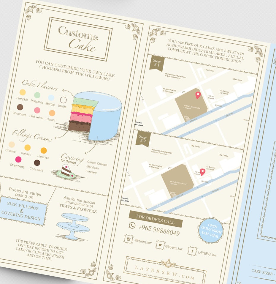 |
| Cake brochure by Luz Viera |
Sure, the chef could throw everything into a bowl and call it good. Or, she could arrange the ingredients in a way that highlights the individual elements inside; she can deliver a message in a beautiful package. With time and care, she can create an incredible experience for the person consuming the meal.
Read on to learn more about the many ways you can structure your design compositions to have the showstopping effect of a perfect seven-tiered cake.
1. The grid
—
Grids give order to graphic design. They speed up the design process by helping designers decide where content should be placed rather than where it could be placed.
- @troytempleman
 |
| Be My Travel Muse website design by DSKY |
Most designers see an invisible grid running through all their designs. In modern web design, clean grid lines have become popular and almost impossible to avoid. There are a few simple reasons for this: grids make your designs cleaner, more efficient and easier to adapt.
Grids bring organization not only to the design, but to the process of creating design. Say you want to create a poster for a lecture series. Create a strong grid and if the dates, times, images and colors all change, your basic designs will feel related. Instant consistency and less time updating and adjusting. Baseline grids also give you a great roadmap when working in a team.
Every designer knows the feeling of relief that comes with opening someone else’s design and seeing a clear grid to follow!
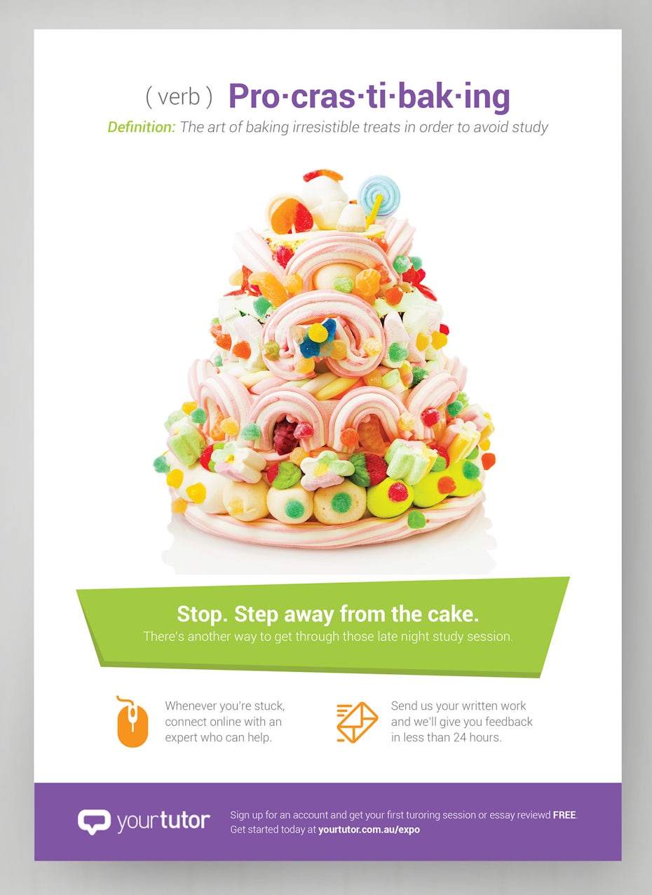
2. Emphasis and scale
The eye generally needs a place to rest or something of interest to hold it, otherwise people will look at your design and quickly move on. Say you take a photograph of your mom at a family reunion. Your purpose is to bring attention to the moment and the joy of the gathering by making your mom the subject and focal point of your composition.
To communicate the message to the viewer that your mom is the focal point, you want to use scale and emphasis. You could place her prominently in the photograph and make sure she is the largest object in the photo. You could emphasize her by blurring the background to make her stand out or focusing her brightly colored dress.
Figuring out the focal point of the design will give your eye the guide it requires to structure the composition, as well as organically build hierarchy. In the design above the focal point is the ridiculous cake—our eyes go right to it and then read the rest for context.
2. Emphasis and scale
 |
| This ad uses color and scale to emphasize the cake, which is the focal point of the design. By adwindesign. |
To communicate the message to the viewer that your mom is the focal point, you want to use scale and emphasis. You could place her prominently in the photograph and make sure she is the largest object in the photo. You could emphasize her by blurring the background to make her stand out or focusing her brightly colored dress.
Figuring out the focal point of the design will give your eye the guide it requires to structure the composition, as well as organically build hierarchy. In the design above the focal point is the ridiculous cake—our eyes go right to it and then read the rest for context.
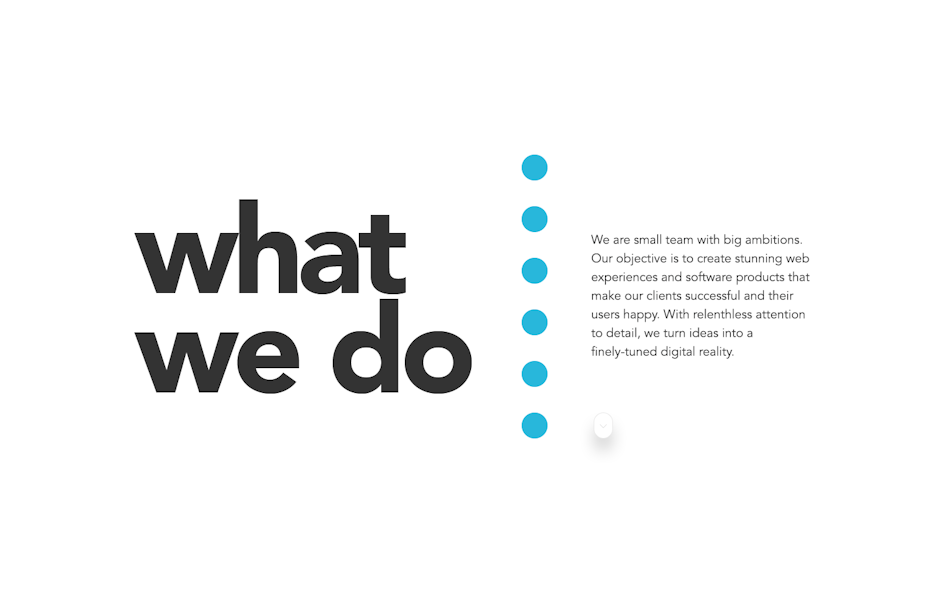
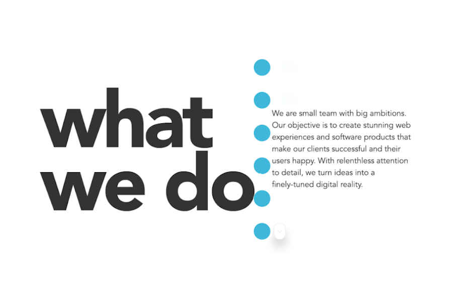
3. Balance
 |
| This web design balances different sized elements perfectly by supporting them with equal white space. By TeeBox ™. |
 |
| What happens when you don’t have any white space. Manipulation by megireid. |
Isn’t everything in life a search for balance? Design is no different. Designers must constantly juggle different elements to find harmony in their design. Imagine an invisible set of scales in each design and make sure you don’t tip the scales by cloistering elements on one side of your grid. The website design above does this cleanly by marrying large type elements (“What We Do” “Our Works”) with smaller, equal-sized paragraphs of longer explanatory copy.
Keep in mind that in terms of composition, white space (or negative space) is also an element. White space gives our eyes paths to follow through the design. Give each element on the page some space to breathe and balance between positive and negative space will emerge organically. You can see how moving the elements in the web design above closer together (thus shrinking the negative space and disrupting the balance of the piece) makes the design claustrophobic and ultimately unsuccessful.
4. Rule of thirds
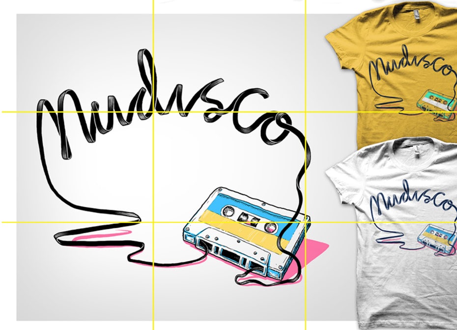 |
| A well balanced t-shirt mock-up using the Rule of Thirds. Via BATHI. |
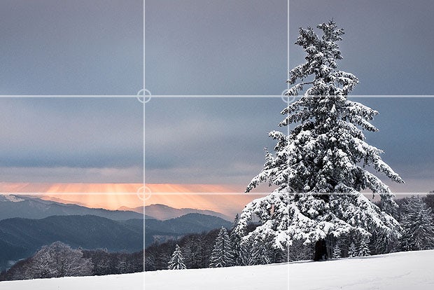 |
| perfectly balanced landscape photo. Via Andreas Wonisch. |
The Rule of Thirds is inescapable in design. It’s a fundamental guideline that’s so simple and effective, it often feels like a cheat: divide your design into three rows and three columns. The points where the vertical and horizontal lines meet form natural guidelines for where you should place your subject and supporting elements. Struggling with finding balance in your designs? The Rule of Thirds is about to become your best friend.
For the most clear examples, look at photographs. In the example above, the focal points (the tree and horizon) are perfectly aligned with the grid created by the Rule of Thirds. If the tree was dead center horizontally and the mountains were directly in the vertical center, the composition would not be so pleasing.
5. Rule of odds
 |
A logo design that uses the Rule of Odds to draw the eye to focal point. Via Freshinnet. |
The Rule of Odds says that pleasing compositions seem to often have an odd number of elements placed in the foreground, most commonly three. The two objects on the outside both balance the focal point in the center, creating a simple, natural balance. (If you’re a wedding photographer this is probably the most difficult rule to follow.) This is often true in logo design, where a centered mark might be offset on either side by the company name, like in Needle Records’ logo.
The power of a well-composed design
This is just an overview of the different ways a designer can shape a composition to have the greatest impact on viewers. As always, remember that rules are meant to be broken. But once you start understanding and executing these rules and structures in your own work, it will improve and strengthen your designs immeasurably.
Source:99 Designs


Comments
Post a Comment