The Evolution Of The John Deere Logo
Though John Deere fashioned his first polished-steel plow in Grand Detour, Illinois in 1837, the evolution of his company took years and remained a small operation for quite some time.
By the time he had employed 16 people, the operation was still without a name and a logo.
However, in 1868, more than 31 years after John Deere’s operation started as a partnership or single proprietorship, it was incorporated under the name Deere & Company.
The company existed for several years and after a brief spell of success, and then failure, the operations began to solidify and consolidate in Illinois. In 1876, after some deliberation, John Deere registered a logo, the “leaping deer” trademark.
1876
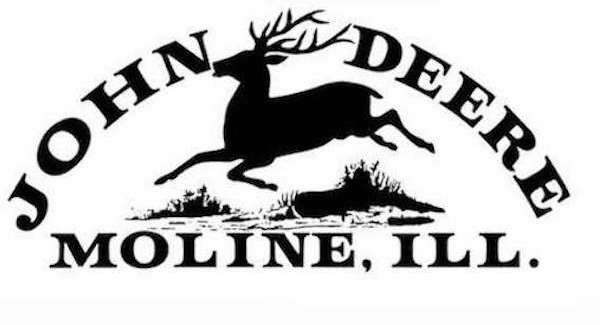 Although it was registered in 1876, the logo has been in use for three years. At this time, the company was producing more than 60,000 plows a year, and it was seen as a necessary move to create a trademark in order to protect against copying and deception.
The original trademark showed a deer bounding over a log, and, according to company sources, it shows an animal that is common to Africa, not the North American white-tailed deer that was portrayed in later logos.
The company existed for several years and after a brief spell of success, and then failure, the operations began to solidify and consolidate in Illinois. In 1876, after some deliberation, John Deere registered a logo, the “leaping deer” trademark.
1876
 Although it was registered in 1876, the logo has been in use for three years. At this time, the company was producing more than 60,000 plows a year, and it was seen as a necessary move to create a trademark in order to protect against copying and deception.
The original trademark showed a deer bounding over a log, and, according to company sources, it shows an animal that is common to Africa, not the North American white-tailed deer that was portrayed in later logos.
1910
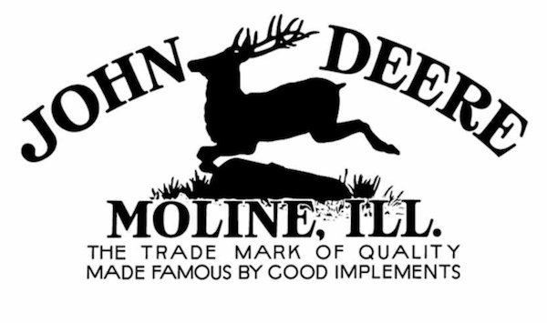
The second version of the John Deere logo was used starting in 1910 and was officially registered in 1912. Though it also featured a deer leaping over a log, there was more detail and definition, and it featured the slogan “The Trade Mark of Quality Made Famous by Good Implements.”
1936
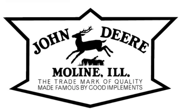
In 1936, the John Deere standardization committee saw a need to adapt its logo so that it would be easier to stencil on products. In response to this declaration, the deer became a solid silhouette and the detail was removed from the artwork.
1950
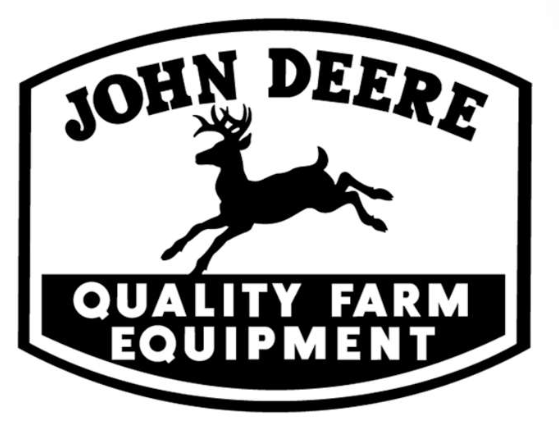
The 1950’s saw several key changes to the John Deere logo, as the deer’s antlers were turned forward. The log was also removed, and a new slogan was integrated into the logo. “Quality Farm Equipment” was placed under the company’s name and Moline, Illinois, was removed due to the global outreach of the brand.
1968
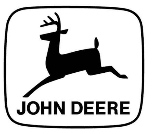
The John Deere logo changed over the next decade and by 1968, it was a simple silhouette of a deer with the company’s name underneath and no slogan. This was used until 2000 when the company sharpened the angles of the deer’s legs and antlers – giving the image a new muscularity and attitude that portrayed the power of the brand.
Source:Machinefinder
Comments
Post a Comment