The Secrets Of Good Graphic Design(With Examples Of The Worst)
Designers are perfectionists. Hours fly by agonising over the tiniest detail until you end up staring at the screen into the early hours before a deadline. We think it’s important to take a step back and realise that even if you submit a piece of work you’re only 99.9% happy with, at least you haven’t committed the design crimes we’ve managed to find below.
This post is here to celebrate the perfectionists among you and explore the achievements of designers around the world. It’s also here to remind ourselves that sometimes, being a perfectionist isn’t a bad thing…..Logo Design
Whether you’re designing a logo with a blank sheet or entirely rebranding a company, encompassing the values of the business whilst adhering to basic likeability is a balance designers find hard to strike.
The Good…
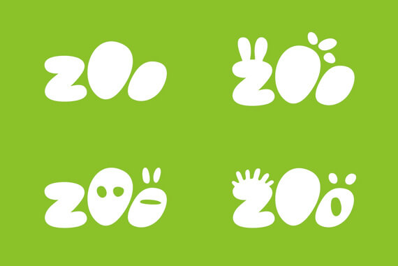
1) San Diego Zoo
San Diego Zoo wanted a new logo which more accurately encapsulated their catchy tagline “Wild at Heart”. The old logo was outdated and didn’t capture the charm and excitement experienced by the thousands of children and adults alike that flock to the park each year. Landor were responsible for the Zoo’s new identity, who stroke to represent the array of unique animals the park offers. “Our identity feels alive” Landor writes on their project page, “- surprising and engaging audiences that can change over time for special events.”
The logo certainly delights, and brings the zoo into a new era of design and entertainment.
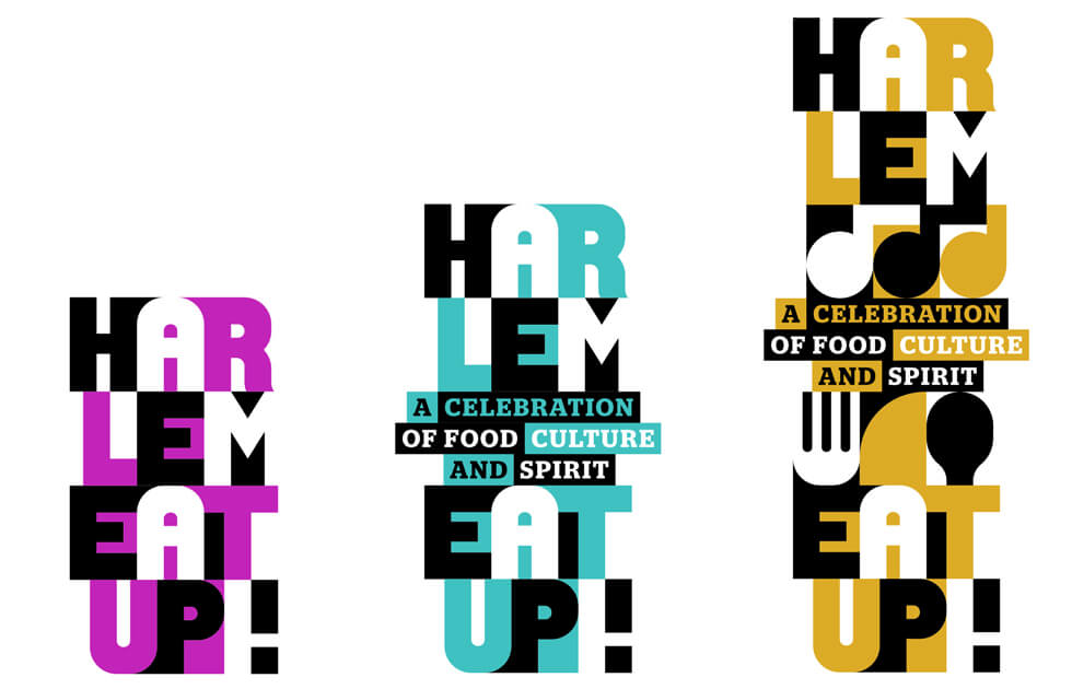
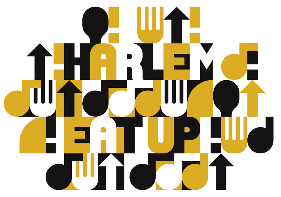
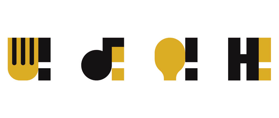
2) Harlem EatUp!
Harlem Eat Up is a celebration of food, culture and spirit in the vibrant and historic borough of Manhattan. OCD is the agency responsible for the festival’s branding, who wanted to incorporate the fun of food in an adaptable design. The brand pattern can be modified to a ‘single note short hand’ logo, ‘systematic stacking messaging’ or a ‘cacophony’ of typeface and icons mashed together. On their website, OCD explain how ‘the whole story of the festival swells from within the text and bubbles out.’ One colour was also too limiting, as no neighbourhood is just one thing. ‘It’s about how every different thing comes together’.
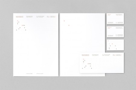
3) Curious Space
The design studio which works out of their Brighton hub wanted a logo which represented their core offering; unique spaces for galleries, museums and public spaces. Compact enough to be compressed and interestingly spaced to be instantly recognisable, the logo is a true portrayal of the agency’s abilities. Typography spans over dots revealing the intricate work that goes into their design of spacing, whilst the flat design contrasts sharply with the spaces they bring to life.
The Bad…
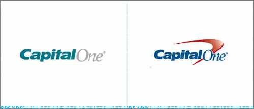
1) Capital One
A huge backlash awaited Capital one after their logo was redesigned in 2008. Graphic Designers worldwide anguished over the seemingly jump back to 80’s corporate ‘go-to’ swish, so common it is now devoid of meaning. However, the intent of the redesign is still there. Brighter, bolder colours that contrast do grab your eye more than its predecessor, however, the fall away from flat design was what had designers pulling their hair out.
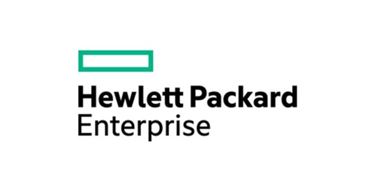
2) Hewlett Packard
Hewlett Packard Enterprise’s logo has actually won (unofficial) awards for the “Most Boring Logo of The Year Award”. Although not horrible on the eye by any means, it is the lack of creativity which some graphic designers criticise the company for. It isn’t as much the typography which offends, but the oddly placed rectangle hovering awkwardly above. Less doesn’t always equal more, and it can be said that minimalism and simplicity is still an ideal that is harder than it looks to achieve.
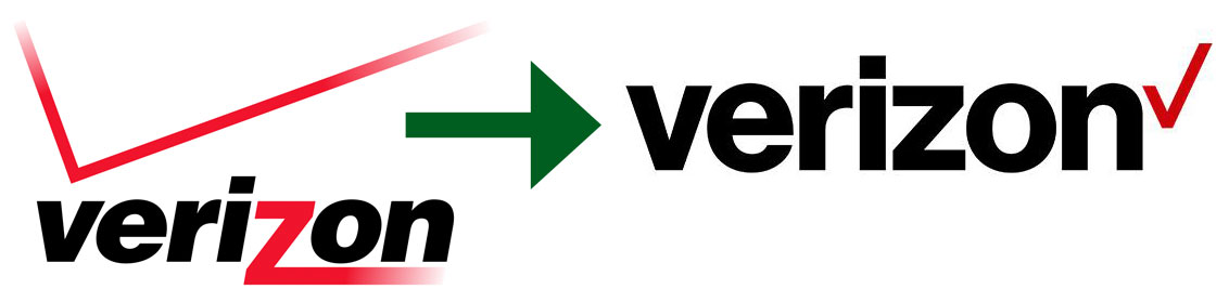
3) Verizon Wireless
Another corporate logo which divided graphic designer’s opinions and caused ripples throughout the design world was Verizon. Kirstina Monllos from Adweek deemed the logo ‘more than refresh than a rebrand’, and at first it received praise for its flat design.
Be it nostalgia or creative difference, designers soon started to pick at mistakes in the Verizon logo, wistfully longing for, the old logo. Tech lover and creative expert Rob Jackson managed to articulate why the old logo represented the company better. The old logo’s tick looked like a signal being dispersed, whilst the new logo resembles an election ballot paper. Although better in theory, the old design more truly represented Verison as a company, and injected personality into the corporate sphere.
Brochure Design
We will now delve into the world of brochure design, where ample space and creative uses of paper delight readers daily. Graphic designers are constantly looking at experimental ways to manipulate paper into fascinating (and informative) brochures, yet as with any design, there’s plenty of room to stray from basic usability…
The Good…
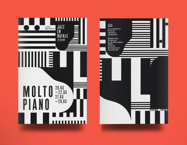
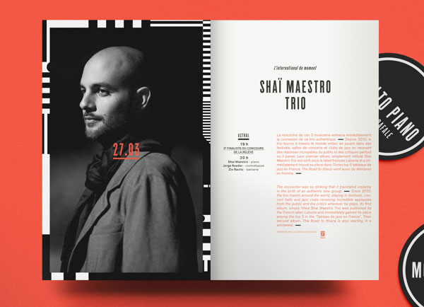
1) Molto Piano
This asymmetric pattern relies on a monochrome colour scheme to accentuate the dramatic effect. The brochure is advertising a jazz festival, and on closer inspection the black and white shapes take the form of piano keys and musical notes, allowing the event it is promoting to live through the layout. The Montreal-based event was adapted for other promotional material such as posters and flyers which have since been collected and sold as art pieces for the home.
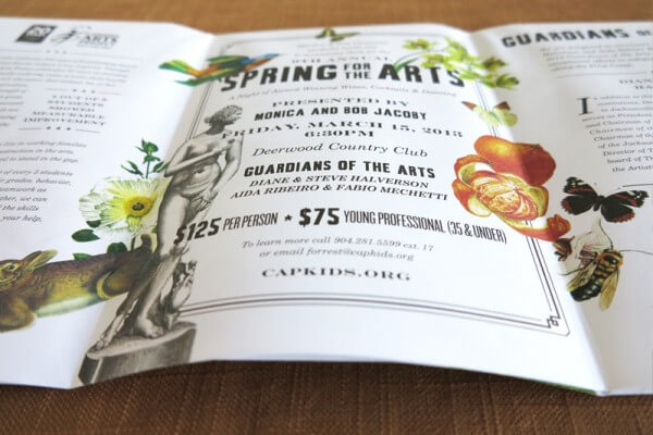
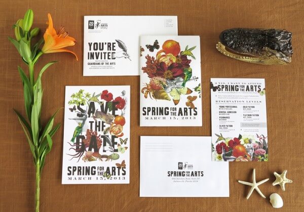
2) Spring for the Arts Event Invitation
Another arts event boasting magnificent graphic design is the Spring for the Arts project in Jacksonville’s annual fundraiser. The brief was to create an invitation for the annual fundraiser which celebrated Florida State’s 500th anniversary back in 2013. Catlin Robinson from agency Wingard Creative was responsible for the gorgeously floral and inviting brochure, fitting a collage of images around bold typography that touches upon Florida’s history, nature and culture.
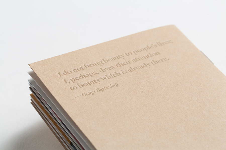
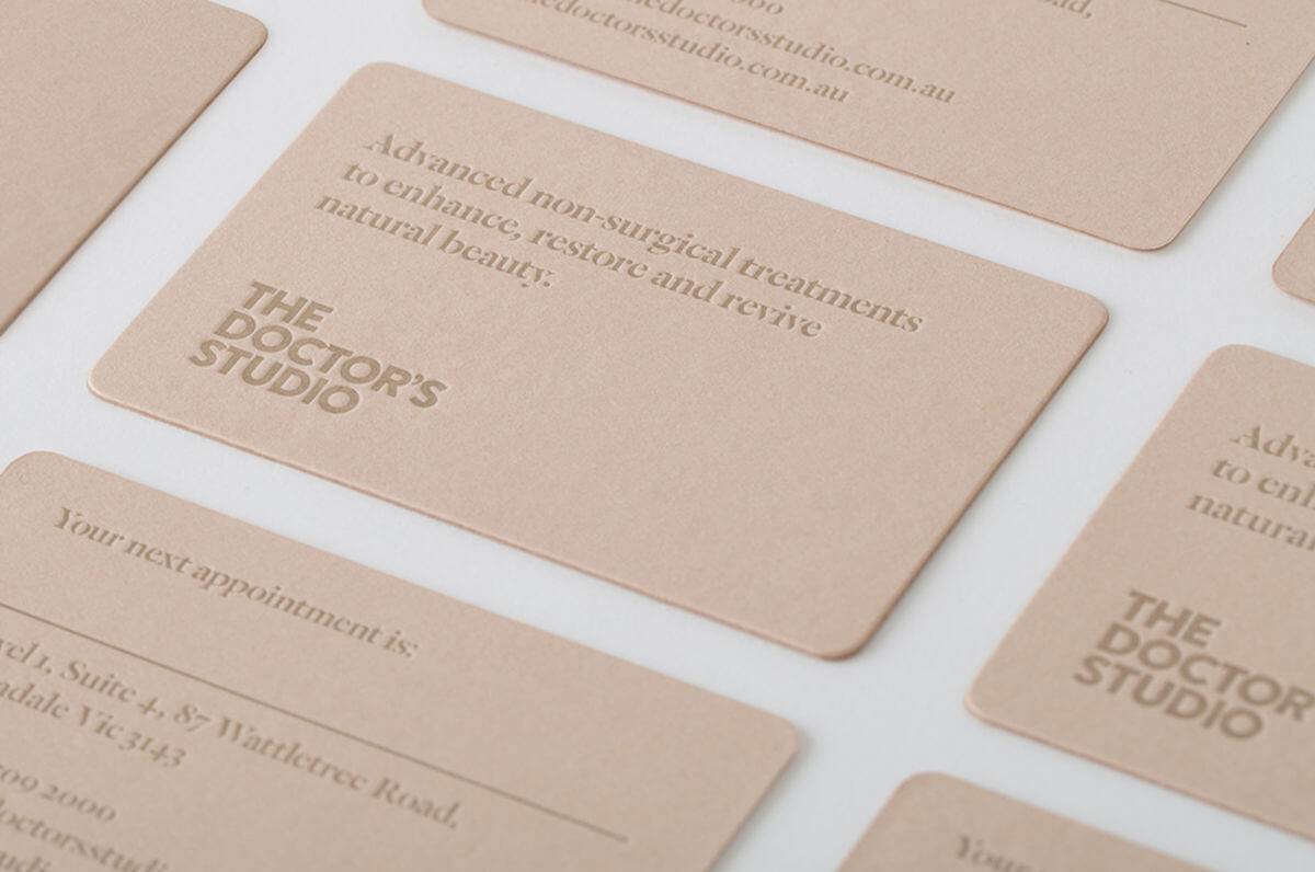
3) The Doctors’ Studio
Dermatology is not the industry that usually lends to admired and acknowledged design. However, graphic design studio A Friend of Mine refused to believe that clinical surgery didn’t deserve unique branding and brilliant print. The aim was to challenge negative opinion of cosmetic surgeries, creating a softer feel for the Australian business that detracted from the harsh stereotype. A more accessible design with warm, neutral colours and rough brown paper stock injected a natural element to the branding, which received praise from around the world.
Vs The Bad…
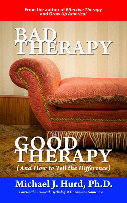
1) Bad Therapy, Good Therapy (and how to tell the difference) Good Design, Bad Design (and how to tell the difference). This brochure could not have come with a more relevant title, and this design needs to comparison to deem segregate it into this section. The awkward typography and aggressive block primary colours give away not much behind the thought process, and doesn’t present the information in an attractive light.
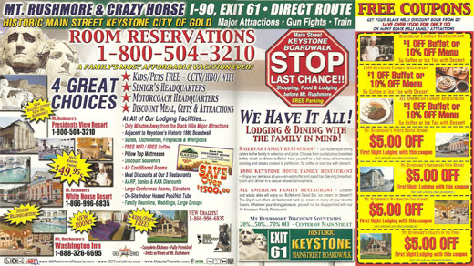
2) ….
We can’t even decipher what this brochure is advertising. Although an extreme example, it serves as a stark warning of overcrowding and shoving as much information into a booklet as humanly possible.
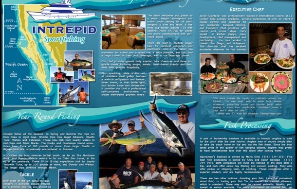
3) Intrepid Sportfishing
Although slightly less cramped than the brochure above, this leaflet does little to entice us in the way of design. The italic font makes it difficult to read, and the text below looks more like an essay than an attention grabbing booklet. A brochure can still be informative and well designed, and this may need a little push into the twenty first century to give it the graphic designer’s seal of approval.
Web Design
Web design has given graphic professionals limitless ways to express creativity. Whilst usability remains at the forefront, websites offer a depth and complexity that enthral viewers who visit. Of course, some choose to instead cram as much into the landing page without even considering what lies beyond the fold.The Good
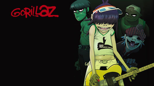
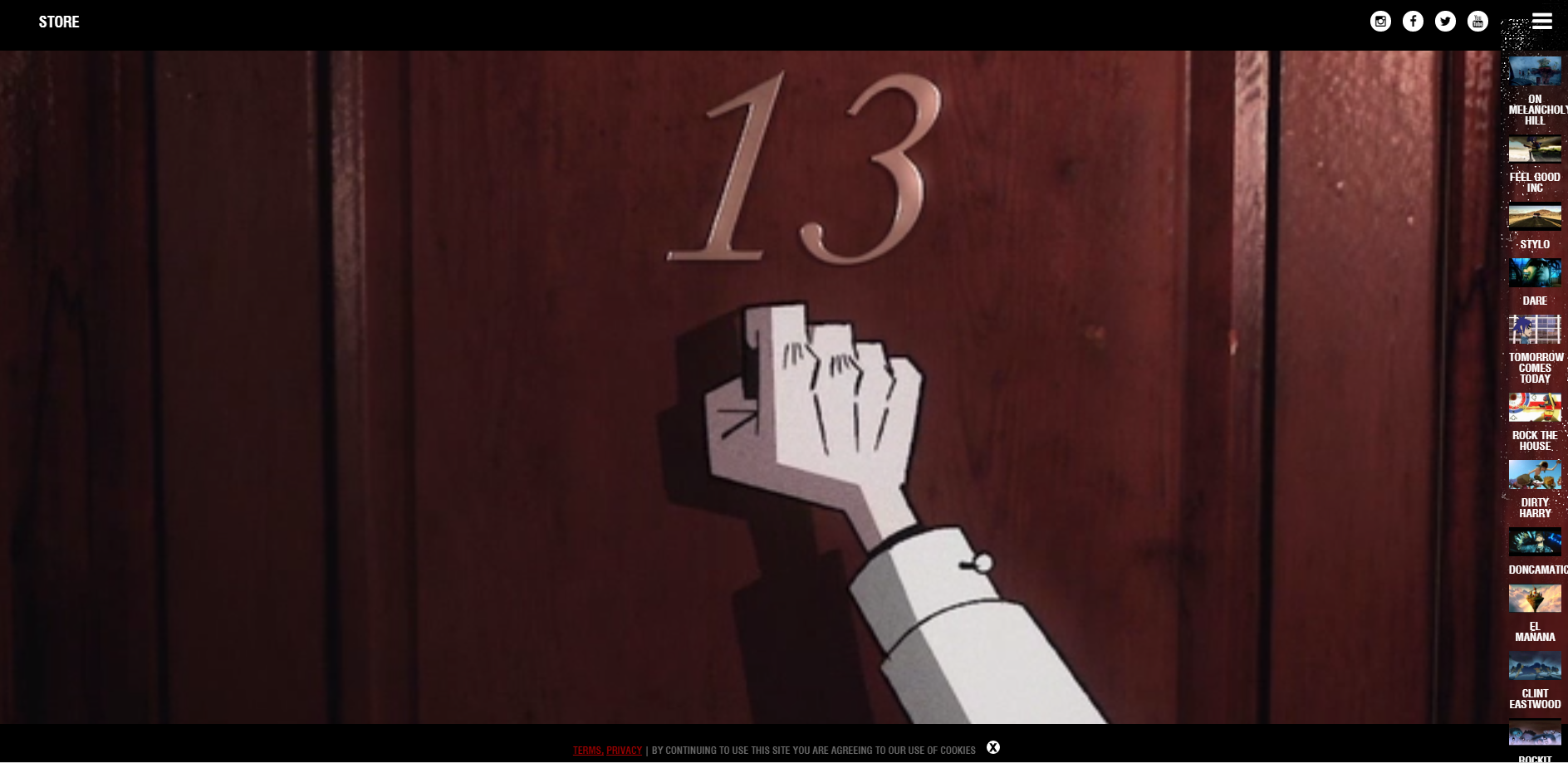
1) Gorillaz
Entering the official website of the virtual group Gorillaz throws you into their world with such force you will not want to pull yourself back into reality. Arguably, the entire band is a triumph in design & branding curtesy of comic book artist Jamie Hewlett and musical legend Damon Albarn.
The entire homepage fills with state of the art animation guiding you through a story, with a minimal sidebar letting you choose whether you want to take a look at a past album, buy merchandise or just admire the character creation.
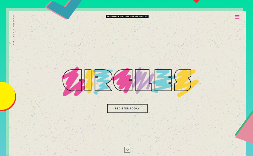
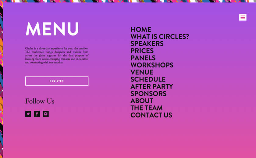
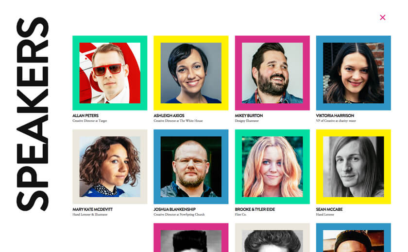
2) Circles
Circles is a conference that brings creative minds from all corners of the globe together for a three-day experience of workshops, panels and speakers. The website certainly inspires creativity, brimming with colour and bursting with life. The logo on the landing page cleverly reminds viewers of where every artist’s creative journey started, a shaky hand trying to fill in shaped with a crayons.
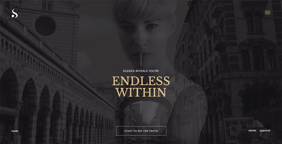
 3) Silenza
 Silenza is a women’s lingerie brand whose website is a fusion of interactive design, video montages and storytelling. Once you enter the site, you have the option to connect with your mobile for a more personalised experience. The site utilises the “hamburger menu” style on its landing page, which allows the designer to play with complex background effects whilst retaining an easy navigation system that users recognise.
The Bad…
1) Ruckwick Steam Show
Have we been transported back in time? This website design is the first thing lecturers and Design College will show the next generation of graphic design NOT to replicate.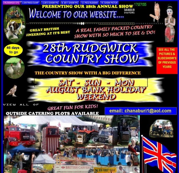
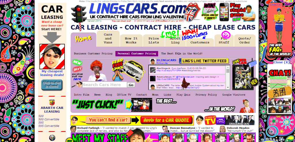
2) Lingscars
You wouldn’t believe that this company actually appeared on BBC’s Dragons Den. A clever idea is unfortunately executed with a design even designers in the nineties would shudder at.
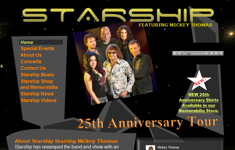
3) Mickey Thomas
Mickey Thomas’s website advertising the 25th Anniversary Tour looks like it hasn’t been updated since the first show in the last century. The design looks fresh out of a Clip Art palette, and needs a definite re-vamp if it’s to sell hard tickets for Starship’s long awaited return!
As freelance graphic designers, we know in this day and age crimes like these could not be committed if you ever wanted to secure a new client again! However, we hope we’ve given you some perspective when you’ve been glaring at a piece of work, agonising how you can improve it just one more time. There’s good graphic design, and there’s bad graphic design, but all we can do is gather inspiration from those around us!
Source:Route1Print


Comments
Post a Comment